Class: RoundProgressBar
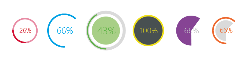
RoundProgressBar widget provides a fully customizable round progress bar with 6 different style to choose from. See below
Synopsis
Functions
- def rpb_setMinimumSize(width, height)
- def rpb_setMaximumSize(width, height)
- def rpb_setMinimum(minValue)
- def rpb_setMaximum(maxValue)
- def rpb_setRange(minValue, maxValue)
- def rpb_setInitialPos(positionFlag)
- def rpb_setValue(value)
- def rpb_reset()
- def rpb_setGeometry(posX, posY)
- def rpb_setLineWidth(width)
- def rpb_setLineColor((R, G, B))
- def rpb_setPathColor((R, G, B))
- def rpb_setPathWidth(width)
- def rpb_setDirection(directionFlag)
- def rpb_setBarStyle(styleFlag)
- def rpb_setLineStyle(styleFlag)
- def rpb_setLineCap(capFlag)
- def rpb_setTextColor((R, G, B))
- def rpb_setTextFont(font)
- def rpb_setTextFormat(typeFlags)
- def rpb_setTextRatio(ratio)
- def rpb_setTextWidth(width)
- def rpb_setCircleColor((R, G, B))
- def rpb_setCircleRatio(ratio)
- def rpb_setPieColor((R, G, B))
- def rpb_setPieRatio(ratio)
- def rpb_enbaleText(bool)
- def rpb_getSize()
- def rpb_getValue()
- def rpb_getRange()
- def rpb_getTextWidth()
Detailed Description
A progress bar is used to give the user an indication of the progress of an operation and to reassure them that the application is still running. A round Progress bar does the same function with the progress indicated moves in a circular pattern.
The round progress bar uses the concept of steps . You set it up by specifying the minimum and maximum possible step values, and it will display the percentage of steps that have been completed when you later give it the current step value. The percentage is calculated by dividing the progress (value() - minimum)/(maximum - minimum)
You can specify the minimum and maximum number of steps with rpb_setMinimum() and rpb_setMaximum() The current number of steps is set with rpb_setValue() The progress bar can be rewound to the beginning with rpb_reset()
Naming Convention
As the PySide2/PyQt5 library is so big and most of the common name is occupied by the various methods in the class, I was limited to use custom name for the methods in the RoundProgressBar class, so I decided to go for a prefix at the beginning of each method name so that it is easy to remember. So to modify the round progress bar style, text, color, etc each time, the method name has to be called with a prefix of rpb_ . So the idea remains the same, eg: that if you want to set the maximum value of progress bar, call the method rpb_setMaximum() and pass the maximum as an argument. This method applies to all other method used in this class.
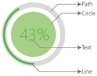
The Round Progress Bar Consist of 5 parts: Text, Line, Path, Circle and Pie. Each of this can be modified individually in terms of color, size etc.
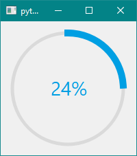
Default Settings: Round Progress Bar
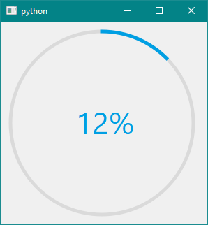
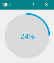
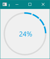
During the first round progress bar creation you will see a round progress bar with the following default properties:
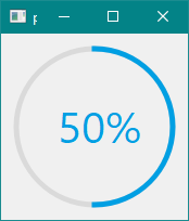
- Style: Donet
- Size: Dynamic: Changes with change in frame size.
- Range: 0 to 100
- Value: 12%
- Start Position: North
- Direction of Progress: Clockwise
- Text Type: Percentage
- Text Font: Segoe UI
- Text Color: (0, 159, 227)
- Text Size: Dynamic: changes with change in size of round Progress Bar.
- Line Width: 5px
- Line Color: (0, 159, 227)
- Line Cap: Square Cap
- Line Style: Solid Line
- Path Width: 5px
- Path Color: (218, 218, 218)
As seen each of the above property and much more can be changes, refer below:
See: Example
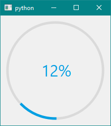
Class roundProgressBar()
Construct a round progress bar with given parent
By default: This gives us a Donet type of round progress bar with minimum and maximum set at 0, 100 with the current Value as 12%.
#INITIALISING A NEW ROUND PROGRESS BAR
import sys
from PySide2 import QtCore, QtWidgets, QtGui
from PySide2exnt.RoundProgressBar import roundProgressBar #IMPORT THE MODULES

class MyWidget(QtWidgets.QWidget):
    def __init__(self):
        QtWidgets.QWidget.__init__(self)

        self.rpb = roundProgressBar() #CREATING A ROUND PROGRESS BAR OBJECT

        self.layout = QtWidgets.QVBoxLayout()
        self.layout.addWidget(self.rpb)
        self.setLayout(self.layout)

if __name__ == "__main__":
    app = QtWidgets.QApplication(sys.argv)
    widget = MyWidget()
    widget.show()
    sys.exit(app.exec_())
PySide2.QtWidgtes.roundProgressBar.rpb_setMinimumSize(width, height)
Parameters : width, height in int
Set the minimum size of the progress bar by passing width and height as argument respectively. By fixing the minimum size the user is limiting the minimum size of the progress bar to the value entered, and when the window size increases round progress bar automatically increases in size.
By Default the minimum size is set to 12*size of line width.
PySide2.QtWidgtes.roundProgressBar.rpb_setMaximumSize(width, height)
Parameters : width, height in int
Set the maximum size of the progress bar by passing width and height provided as argument respectively. By fixing the maximum size the user is limiting the size of the progress bar to the value entered, and when the window size decrease much lower than the user entered widget maximum the round progress bar automatically reduces the size (until the user manually specifies the minimum size of the widget).
By default the maximum size is the size of the canvas itself, i.e. dynamic size change.
PySide2.QtWidgtes.roundProgressBar.rpb_setMinimum(min)
Parameters : min value for the progress bar
Set the round progress bar minimum value to min.
By default the minimum value is 0.
See Example
PySide2.QtWidgtes.roundProgressBar.rpb_setMaximum(max)
Parameters : max value for the progress bar
Set the round progress bar minimum value to max.
By default the maximum value is 100.
See Example
PySide2.QtWidgtes.roundProgressBar.rpb_setRange(min, max)
Parameter : min and max range
Sets the minimum and maximum range of the round progress bar.
By default the range is (0, 100)
See Example
PySide2.QtWidgtes.roundProgressBar.rpb_InitialPos(positionFlags)
Parameter: Position Flag: North, South, East West as string.
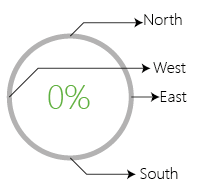
By default: Initial Position is North
#EXAMPLE OF USING INITIAL POSITION FLAGS
self.rpb.rpb_setInitialPos('South')
Output:
See Example
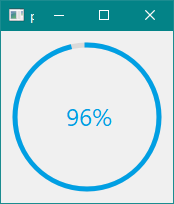
PySide2.QtWidgtes.roundProgressBar.rpb_setValue(value)
Parameter: value in int
The value should be between the min and the max range and the following equation is used to calculate the %: (value() - minimum)/(maximum - minimum).
By Default value is set at 12%
#USING THE SETVALUE METHOD:
self.rpb.rpb_setValue(96)
PySide2.QtWidgtes.roundProgressBar.rpb_reset()
Makes the progress pointer to the minimum value. i.e. 0%.
PySide2.QtWidgtes.roundProgressBar.rpb_setGeometry(posX, posY)
Parameter: posX and posY in int
This moves the origin coordinated of the round progress bar from (0, 0) to (posX, posY).
PySide2.QtWidgtes.roundProgressBar.rpb_setLineWidth(width)
Parameter: width in int
Sets the width of the line to the given width . In this way you can increase or decrease the width of the line. By default line width is 5px
#INCREASING THE LINW WIDTH
self.rpb.rpb_setLineWidth(10)
PySide2.QtWidgtes.roundProgressBar.rpb_setLineColor((R, G, B))
Parameters: tuple of R, G, B
Changes the color of the line to the specified R, G, B spectrum.
By default line color is : (0, 159, 227)
#CHANGE THE LINE COLOR
self.rpb.rpb_setLineColor((255, 0, 0)) #CHANGING THE LINE COLOR TO RED
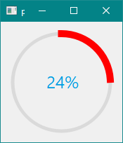
See Example
PySide2.QtWidgtes.roundProgressBar.rpb_setPathWidth(width)
Parameter: width in int
Sets the width of the path to the given width . In this way you can increase or decrease the width of the path. By default path width is 5px
#INCREASING THE LINW WIDTH
self.rpb.rpb_setPathWidth(15)
See Example
PySide2.QtWidgtes.roundProgressBar.rpb_setPathColor((R, G, B))
Parameters: tuple of R, G, B
Changes the color of the path to the specified R, G, B spectrum.
By default path color is : (218, 218, 218)
#CHANGE THE PATH COLOR
self.rpb.rpb_setPathColor((0, 0, 0)) #CHANGING THE PATH COLOR TO BLACK
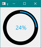
See Example
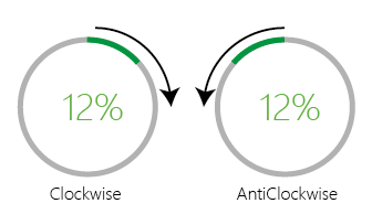
PySide2.QtWidgtes.roundProgressBar.rpb_setDirection(directionFlag)
Parameter: Direction Flag: Clockwise or AntiClockwise as string.
Sets the direction of the progress bar motion to clockwise or anticlockwise direction.
By default the direction is Clockwise
See Example
PySide2.QtWidgtes.roundProgressBar.rpb_setBarStyle(styleFlag)
Parameter: Style Flags: Donet, Line, Pizza, Pie, Hybrid1 and Hybrid2 as string.
As told earlier the round progress bar has total of 6 different types of as listed below:
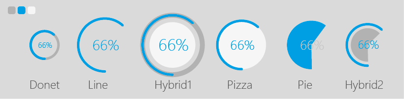
Just type the style flag in the field to take palce.
#SETTING THE STYLE OF THE ROUND PROGRESS BAR:
self.rpb.rpb_setCircleRatio(1) #SEE BELOW FOR INFO ON CIRCLE
self.rpb.rpb_setBarStyle('Pizza')
Output:
See Example
PySide2.QtWidgtes.roundProgressBar.rpb_setLineCap(linecapFlags)
Parameter: Line Cap Flags: SquareCap and RoundCap as string.
This settings changes the stroke cap to either square or to a circle. See below:

By Default the line cap is set to SquareCap.
#SETTING THE LINE CAP
self.rpb.rpb_setLineCap('RoundCap')
See Example
PySide2.QtWidgtes.roundProgressBar.rpb_setLineStyle(linestyleflags)
Parameters: Line Style Flags: SolidLine, DotLine and DashLine as string.
The line style setting from the continuous Solid line to the dot lines to the dash line.
#LINE STYLE
self.rpb.rpb_setLineStyle('DotLine')
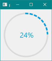
#LINE STYLE:
self.rpb.rpb_setLineStyle('DashLine')
See Example
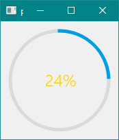
PySide2.QtWidgtes.roundProgressBar.rpb_setTextColor((R, G, B))
Parameter: Tuple in the form : R, G, B
Set the text color of your desire with passing a tuple of R, G, B.
#TEXT COLOR
self.rpb.rpb_setTextColor((255, 220, 0)) #SETTING THE COLOR TO YELLOW
See Example
PySide2.QtWidgtes.roundProgressBar.rpb_setTextFont(fontFlags)
Parameters: Font names like Arial, Segoe UI, Times , Times New Roman e.t.c. default fonts of windows/linux/macOS.
By default the text font is Segoe UI
#SETTING THE TEXT FONT
self.rpb.rpb_setTextFont('Times')

See Example
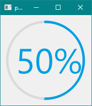
PySide2.QtWidgtes.roundProgressBar.rpb_setTextFormat(typeflags)
Parameter: Text type flags: Value or Percentage as string
Choosing the value will display the raw value of the progress, while setting it to the percentage will display the percentage occupied by the value between the minimum and maximum.
#TEXT TYPE
self.rpb.rpb_setMaximum(360)
self.rpb.rpb_setTextFormat('Value') #SET THE TEXT TYPE TO VALUE
self.rpb.rpb_setValue(180)
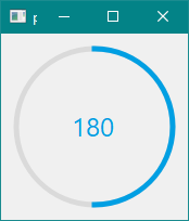
self.rpb.rpb_setMaximum(360)
self.rpb.rpb_setTextFormat('Percentage') #SET THE TEXT TYPE TO PERCENTAGE
self.rpb.rpb_setValue(180)

See the above example where we set the maximum value of the progress bar to 360, making the range from 0 to 360, then set the value to 180, we can see when the text format is in Value it displays 180 on the other hand when the text format is Percentage it shows as 50%.
See Example
PySide2.QtWidgtes.roundProgressBar.rpb_setTextRatio(ratio)
Parameters: ratio in int
By default the ratio is set to 8, which makes the text size 1/8 of the size of the round progress bar and this is even dynamic i.e. as the size of the round progress bar changes the text size also changes automatically. You can set the text ratio to any value > 2 i.e. from 3 to any value as value < 2 will collide with the progress bar significantly.
#TEXT RATIO
self.rpb.rpb_setTextRatio(3) #SET THE TEXT SIZE TO 1/3 OF SIZE OF THE ROUND PROGRESS BAR
See Example
PySide2.QtWidgtes.roundProgressBar.rpb_setTextWidth(width)
Parameters: width in int
By default the text font is dynamic i.e. it changes with the change in shape of the round progress bar, but you can always change this by making a constant text width, making the dynamic text feature turn off. This method makes the width you entered as the width of the text.
#TEXT WIDTH
self.rpb.rpb_setTextWidth(30)
Remember that the using rpb_setTextRatio() enables the dynamic text, which makes the text size change with respect to the change in size of the round progress bar, but the method rpb_setTextWidth() disables the dynamic text feature and makes the constant text size, with no effect in the change in size of the round progress bar.
See Example
PySide2.QtWidgtes.roundProgressBar.rpb_setCircleColor((R, G, B))
Parameters: Tuple in the form : R, G, B
Changes the color of the circle in the bar style Pizza and Hybrid1.
Default color is :(218, 218, 218)
#CHANGE THE COLOR OF THE CIRCLE
self.rpb.rpb_setBarStyle('Hybrid1') #CHANGE THE BAR STYLE TO HYBRID
self.rpb.rpb_setCircleColor((200, 120, 20)) #CHANGE THE COLOR
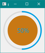
See Example
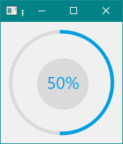
PySide2.QtWidgtes.roundProgressBar.rpb_setCircleRatio(ratio)
Parameter: ratio in int
The circle size is determined by the size of the progress bar, i.e. by default the ration is set to 0.8 means the size of the circle will be 0.8 times the size of the round progress bar, but you can change this by using this method.
#CIRCLE RATIO EXAMPLE
self.rpb.rpb_setCircleRatio(0.5) #MAKES THE CIRCLE 0.5*SIZE OF THE PROGRESS BAR
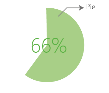
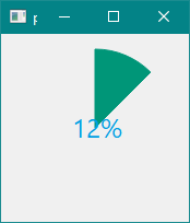
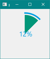
PySide2.QtWidgtes.roundProgressBar.rpb_setPieColor((R, G, B))
Parameters: Tuple in the form : R, G, B
Changes the color of the pie in the bar style Pie and Hybrid2.
Default color is :(218, 218, 218)
#PIE COLOR
self.rpb.rpb_setBarStyle('Pie')
self.rpb.rpb_setPieColor((0, 150, 120))
self.rpb.rpb_setValue(45)
See Example
PySide2.QtWidgtes.roundProgressBar.rpb_setPieRatio(ratio)
Parameter: ratio in int
Pie size by default is 0.8*(minimum size, maximum size), but this can be changes by changing the value of the ratio, this method can be used in the two bar style type: Pie and Hybrid2
#PIE RATIO
self.rpb.rpb_setBarStyle('Hybrid2')
self.rpb.rpb_setPieColor((0, 150, 120))
self.rpb.rpb_setValue(45)
self.rpb.rpb_setPieRatio(0.9)
PySide2.QtWidgtes.roundProgressBar.rpb_enableText(bool)
Parameter: True or False
Enable or disable the text inside the round progress bar.
PySide2.QtWidgtes.roundProgressBar.rpb_getSize()
Return: int
This method returns the size of the round progress bar in int.
PySide2.QtWidgtes.roundProgressBar.rpb_getValue()
Return: int
This method returns the current value displayed by the round progress bar in int.
PySide2.QtWidgtes.roundProgressBar.rpb_getRange()
Return: tuple of (minimum, maximum)
Returns the maximum and minimum value of the round progress bar.
PySide2.QtWidgtes.roundProgressBar.rpb_getTextWidth()
Return: int.
This method returns the width of the text displaying the value in the round progress bar.
Also See: Round Progress Bar Examples